Experimental Type: Zesty and the Letter Z
This piece was my first ever project that focused solely on typography. I hadn’t taken the time in my education at this point to delve deep into the art of typography, and I feel that this class helped me focus more on that when it comes to my art.
How do I explain my thoughts and creative ideas through type?
How can type be used in my art?
What place does type have in my art? What purpose?
I thought about that a lot in this class, and especially with this assignment. I was tasked with making a poster using a random letter with a random font. Depending on the letter I chose, I had to base my entire poster around a word beginning with that letter. I didn’t want to overthink it. I like fun, whimsical fonts. I like bright colors. With each step, my idea fell into place. I chose the letter Z, and chose the word zesty.
I didn’t realize how fun the word zesty was until this project! Now I like it a lot!
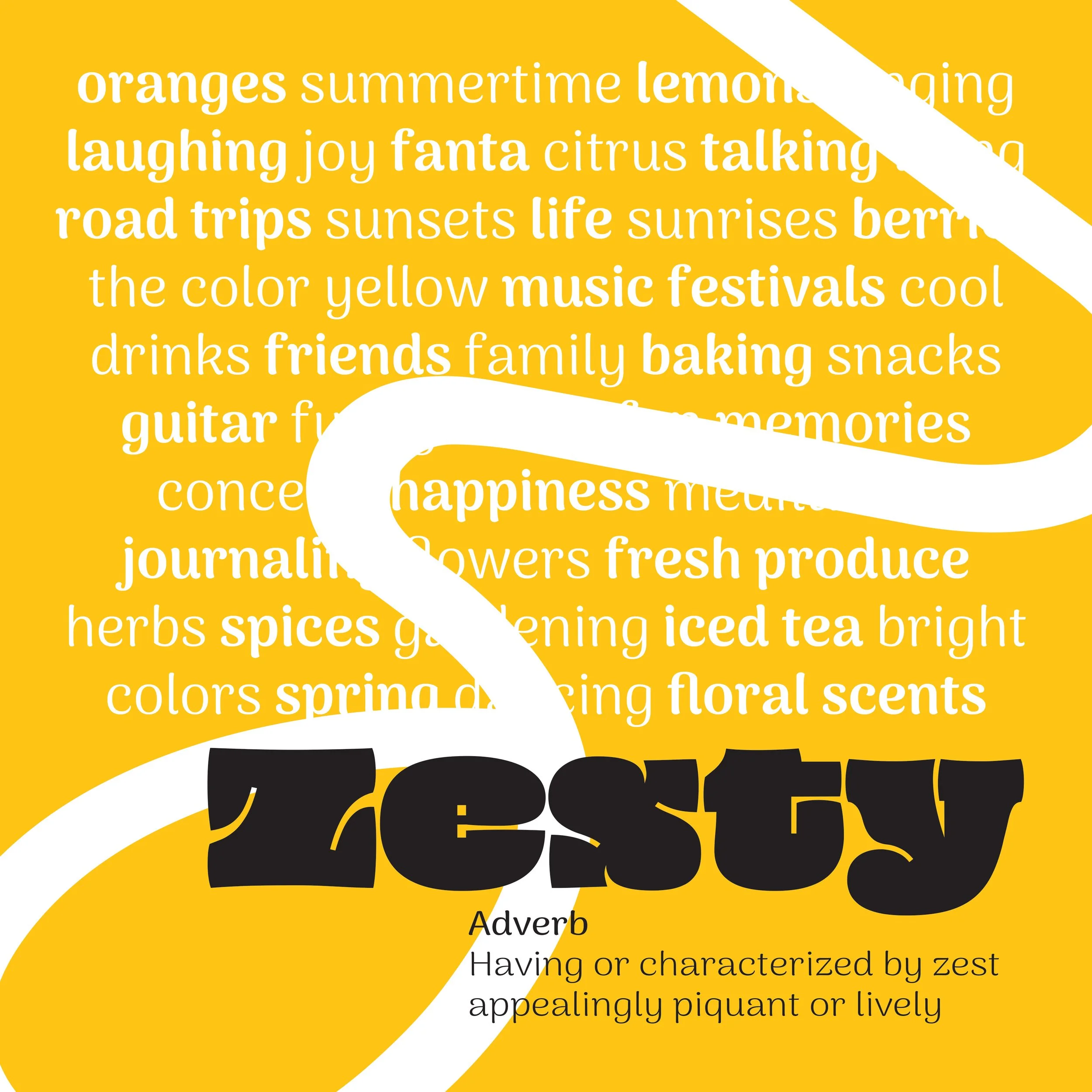
Nouran Badawy | Zesty | 2024 | Illustrator | 11x11